Competitor Branding
Breakdown
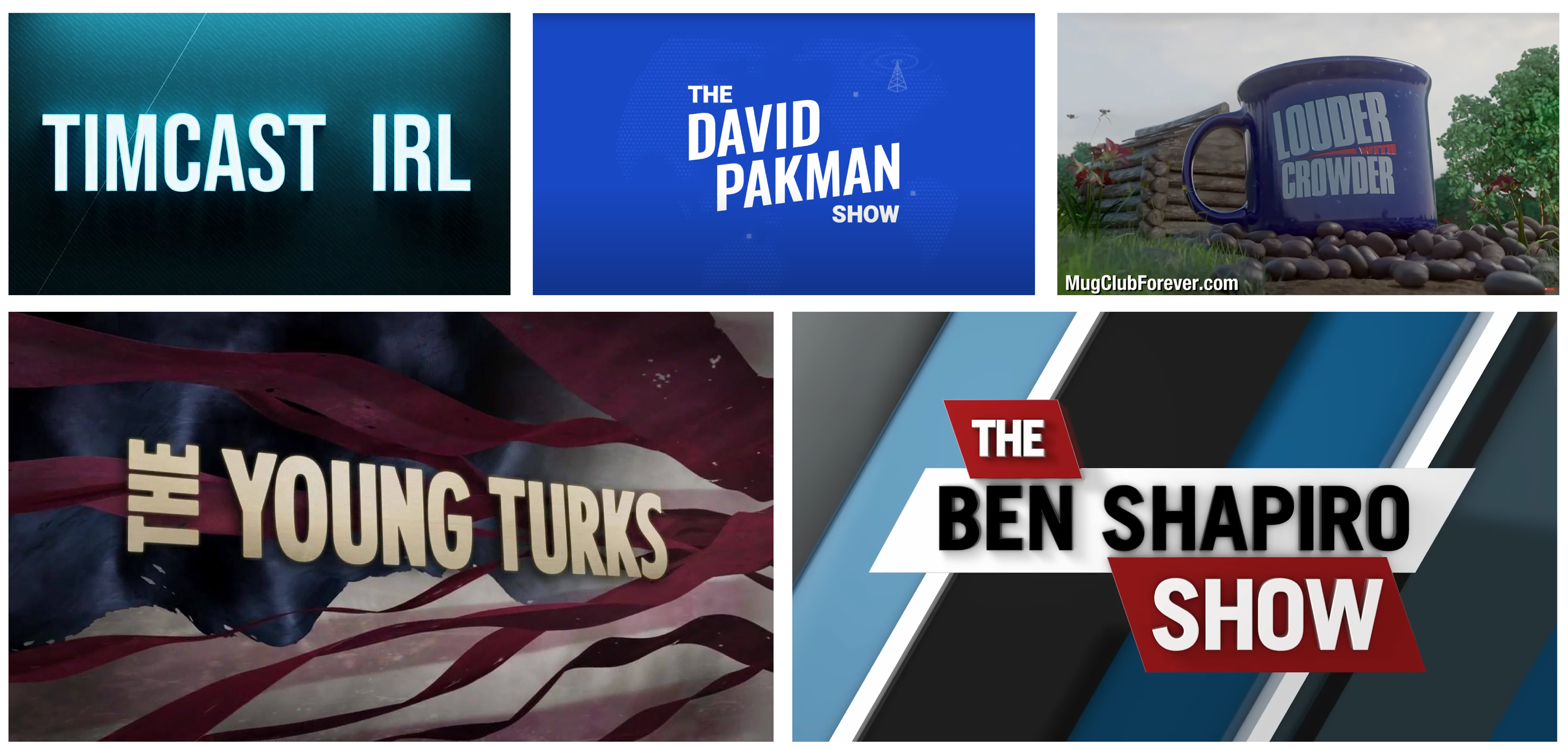
As part of my brand proposal, I would like to take a closer look at some of the top players in the industry. I have carefully selected five of the most notable competitors, Tim Pool, David Pakman, Steven Crowder, The Young Turks, and The Daily Wire, to analyze and understand the branding elements that have contributed to their success. In this segment, I'll be breaking down each competitor's visual identity and messaging. By taking a closer look at these industry leaders, we can gain valuable insights and inspiration for the direction Steven's brand should take. Let's dive in!

Tim Pool's branding is known for its straightforward style, focusing on delivering raw and unedited news coverage. While this approach has proven to be effective in capturing the attention of certain audiences, it also leaves room for improvement in terms of diversifying content and presenting information in a more thoughtful and nuanced manner. Additionally, Tim Pool's branding lacks a clear sense of identity and values, making it harder for him to build a strong connection with his audience. As a result, his branding may not appeal to individuals looking for a more well-rounded and considered approach to the issues he covers.
The title card for his show, reminiscent of a neon sign, adds a bit of personality along with the animated effects behind the type. His set overall shows a bit of personality, but still misses the mark as far as creativity and cohesion with the rest of his branding.
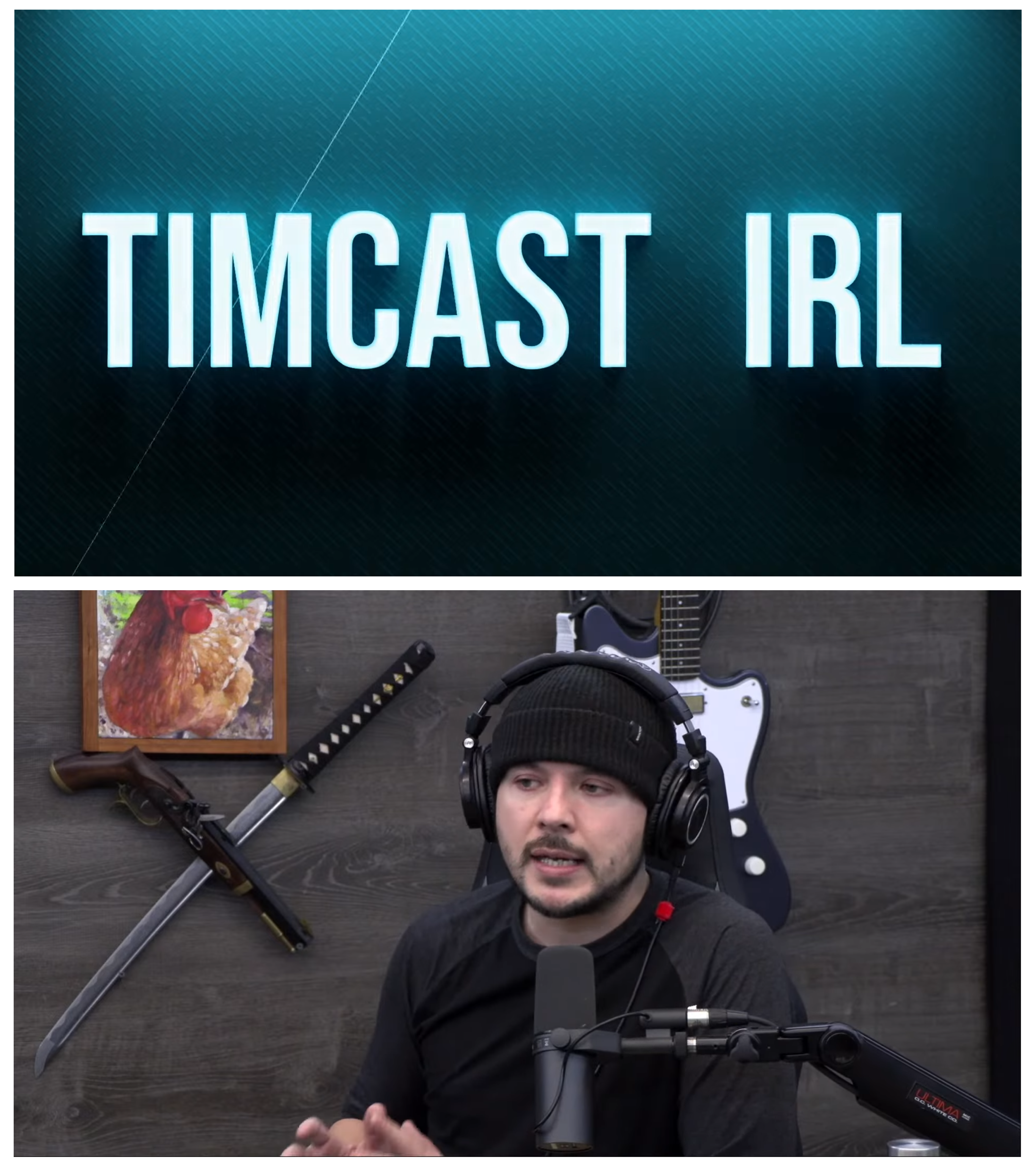
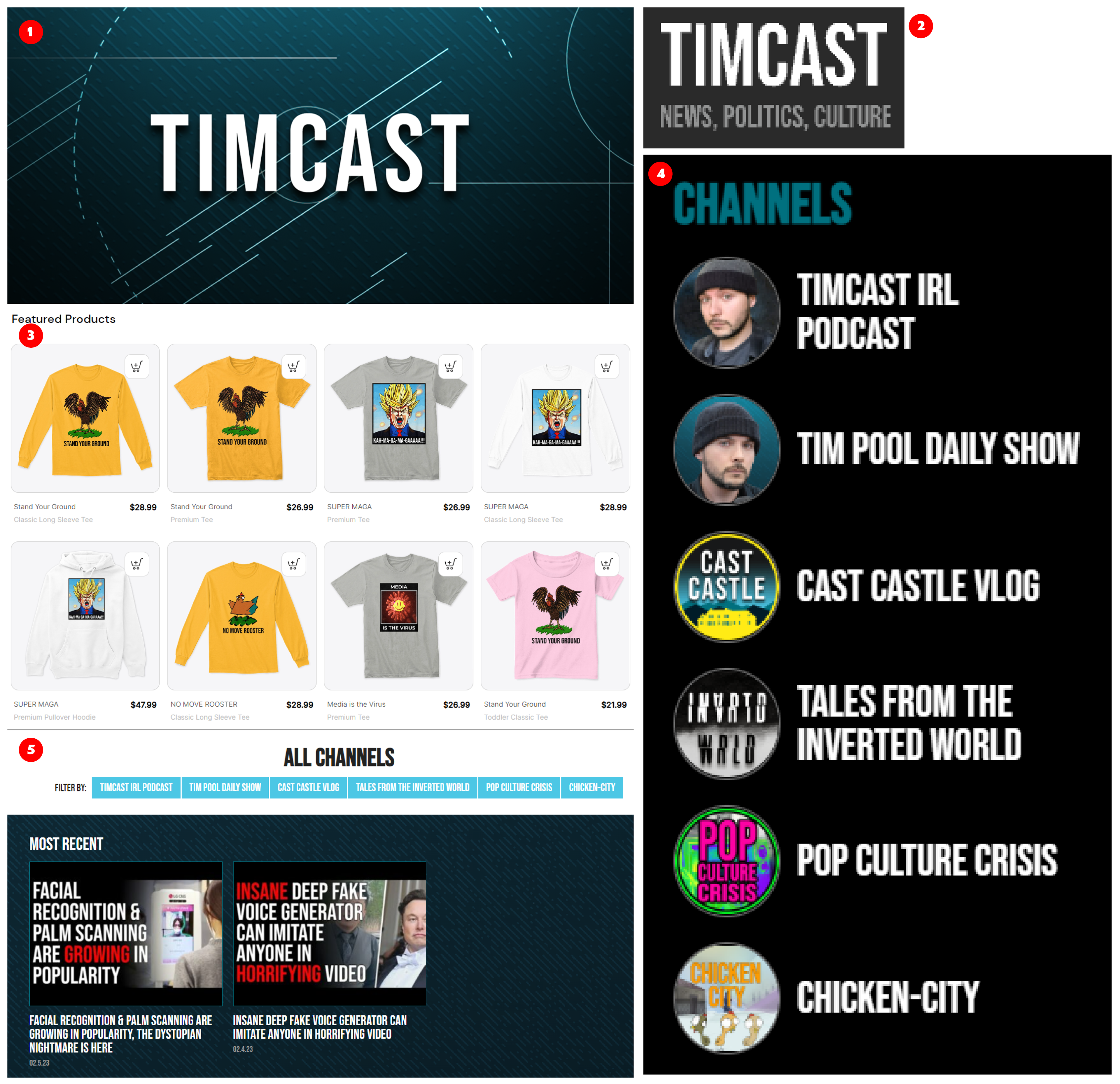
Overall, Tim's branding and logo are pretty weak and amateur looking. It lacks creative direction and personality. Considering his audience size, one would expect something more professional and creative. His website feels dated and crowded. All the type (1, 4, 5), including his logo(2), is the same condensed font face, and doesn't offer any kind of contrast. From the perspective of someone unfamiliar with him, his branding doesn't have any kind of draw. His merch is pretty limited, and doesn't contain any branding (3). Unless you're in on the joke, the merch is lack luster.
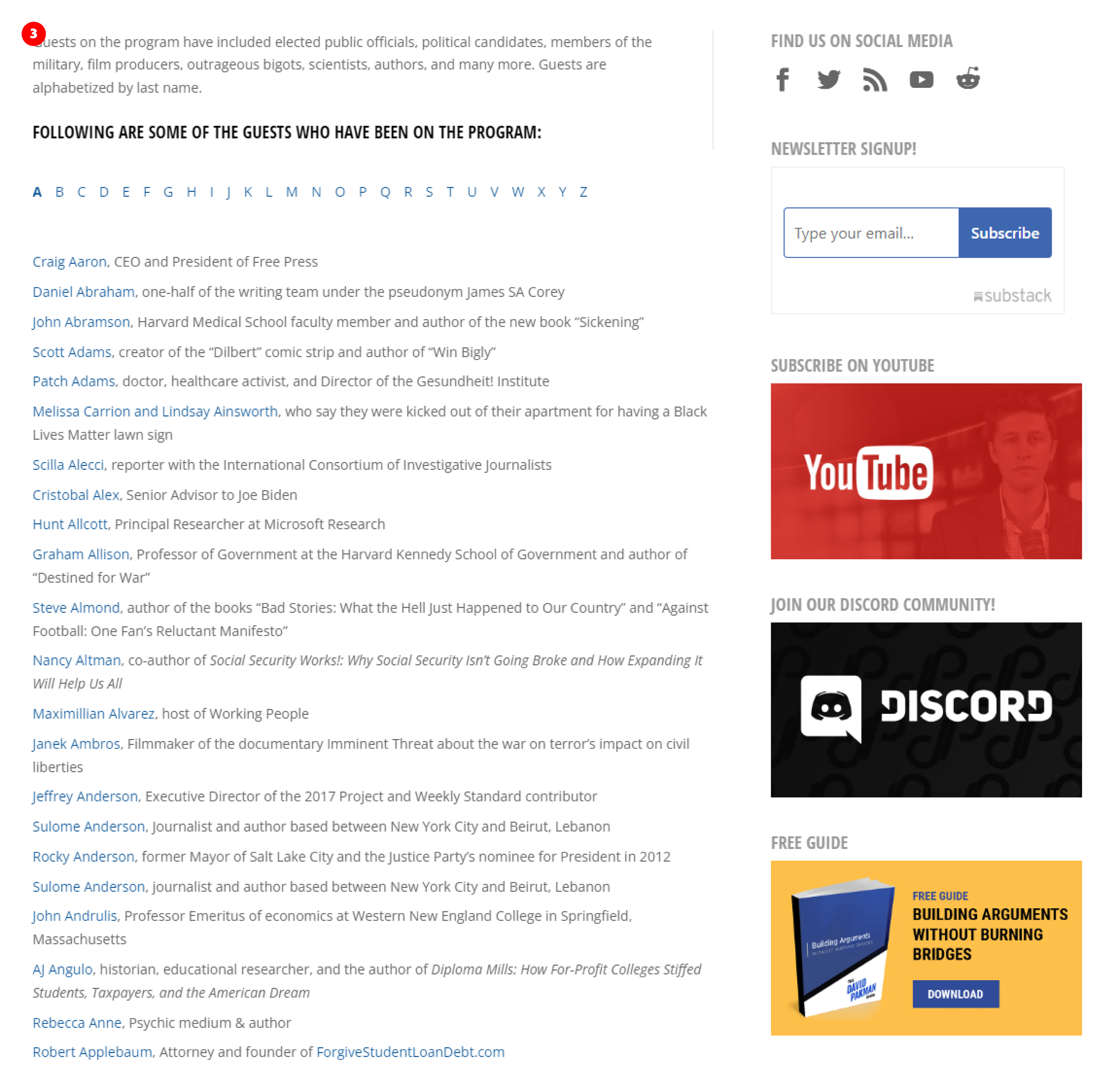
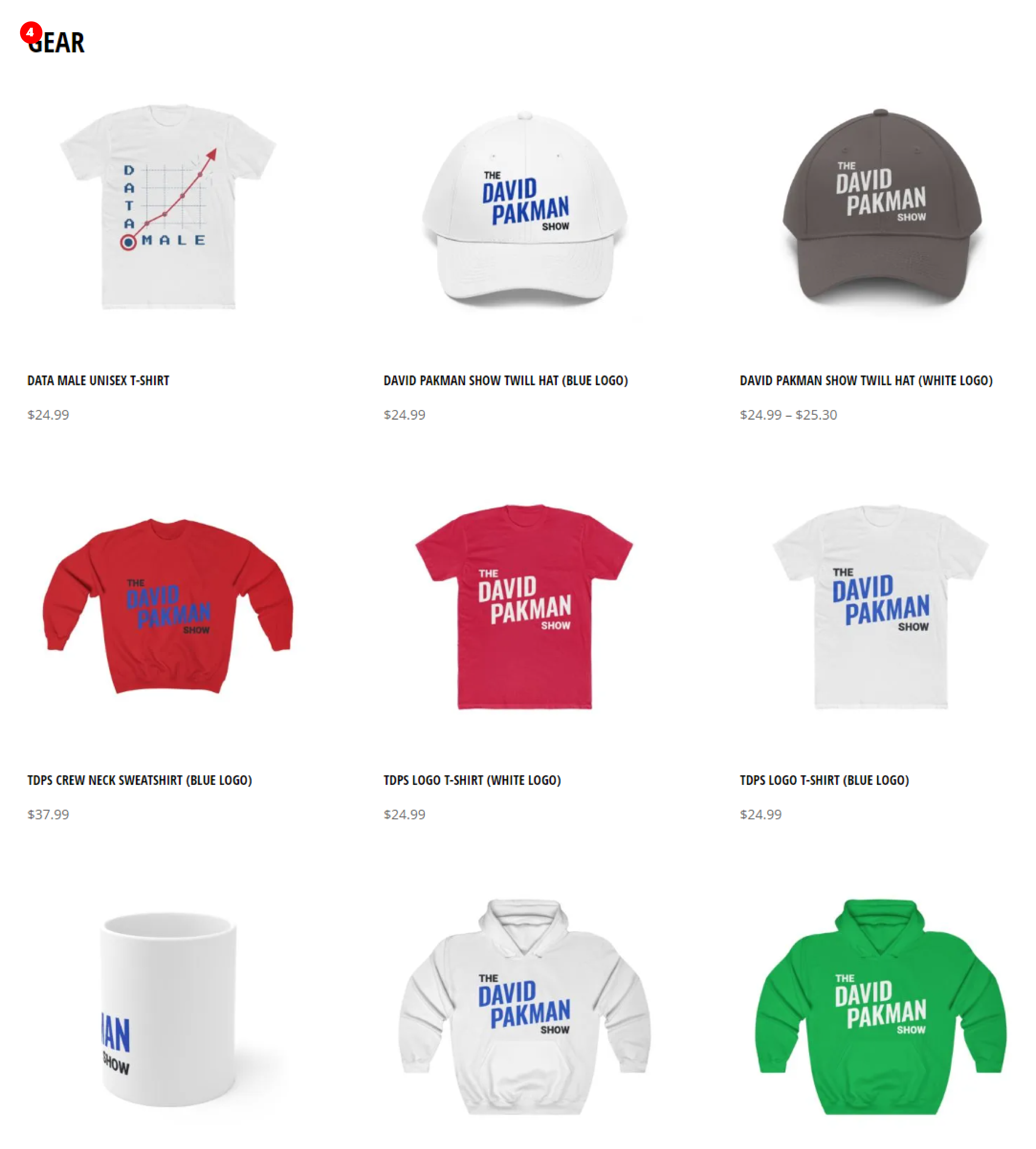
David Pakman's branding appears to prioritize professionalism and objectivity. Similar to Tim Pool's branding, some would say that it comes across as stale and lacking in personality. While having a professional image is important, it's also important to have some personal flair and individuality in one's branding to stand out and connect with the audience.
His title card is subtle, but clean and professional. His set is small and intimate, so the simplicity of his branding works in his favor in this instance. As far as I know, he is working on a new set at the moment, so it will be interesting to see what they come up with.
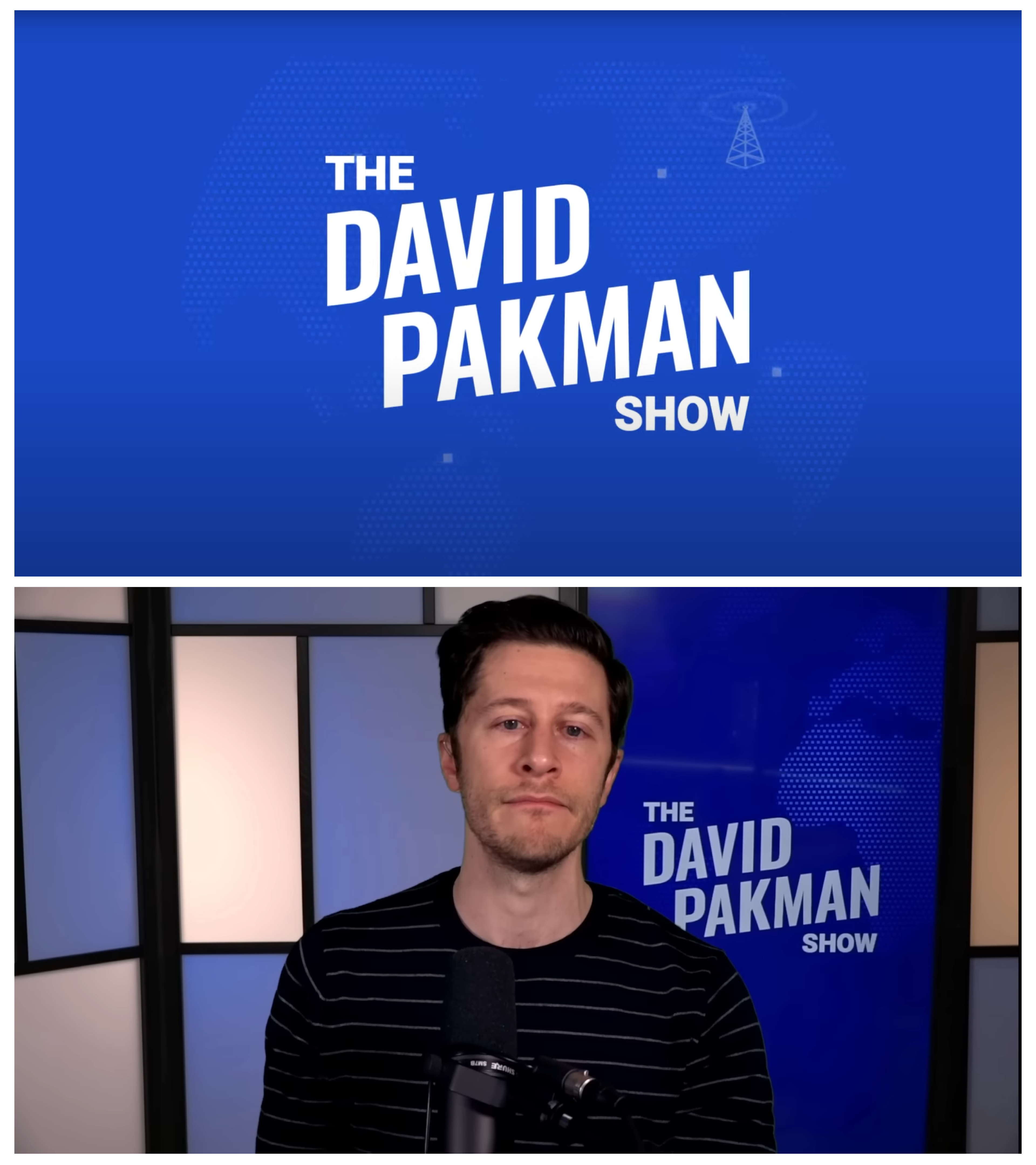
Overall, David's branding is clean, but it's too simplistic and lacks personality. A brand can look professional and clean as well as show contrast and personality. His logotype (1), though simple, has some nice contrast and movement.
His website is plain and unengaging. That may be because the focus is more on YouTube and Twitch, and the website is more of an afterthought. Considering that creators are losing their platforms without notice, it would be a good idea to invest more into the development of their websites BEFORE they have to rely on them solely for putting out their content.
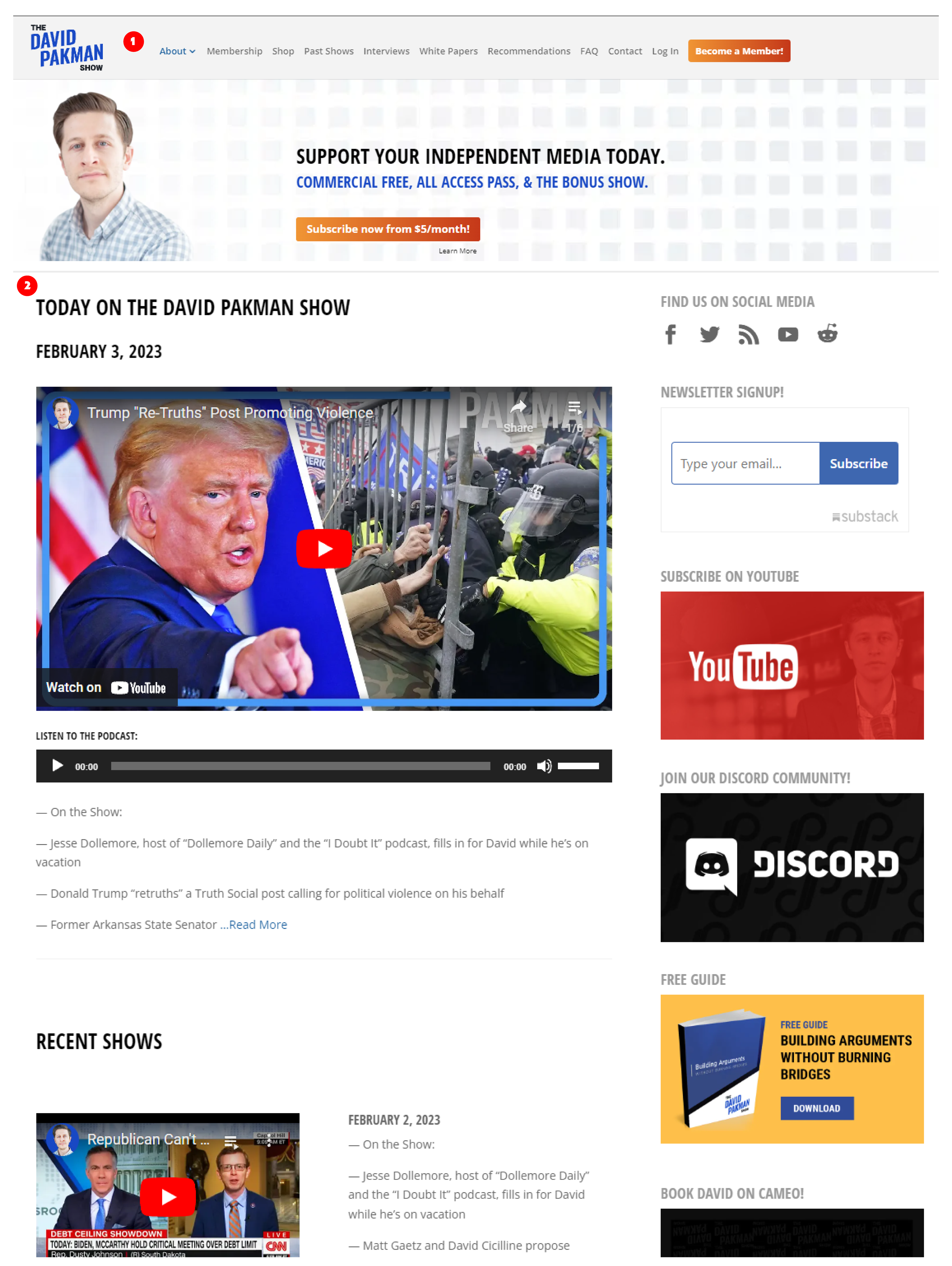
A lot of content is just a simple list of information and links (3).It's functional, but again it's not engaging. If they were able to have thumbnails of at least the most popular videos, it would help create some interest on the page.
His merch? Not bad, but not good. Also, having someone wearing the merch is better to have than not. It at least has his branding, and it seems to be good quality. Maybe in the future this will be more fleshed out.
Steven Crowder's branding focuses on a conservative and politically incorrect humor style. Crowder's content often addresses controversial topics in a sarcastic and witty manner, which has led to a large following among conservative audiences. His brand also frequently uses American flags and patriotic imagery, emphasizing his conservative values. The typography and design elements of his branding are bold and impactful, designed to grab the attention of his audience and create a strong visual representation of his brand.
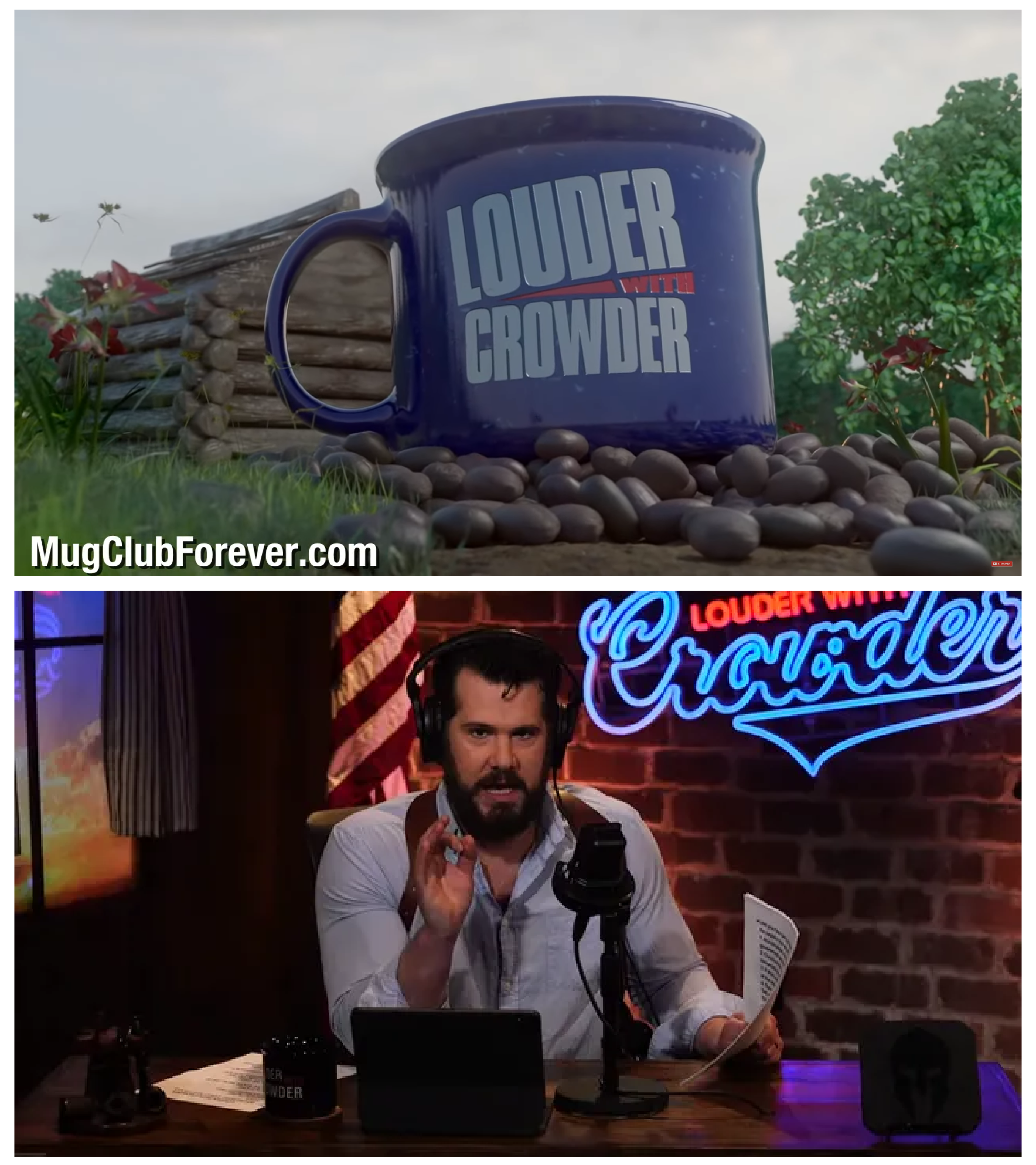
His title card for the show is a bit much, but it's animated, original and fits his brand. The last frame with the mug is pretty nice though. His set gives "man-cave" vibes, but it's done well and looks inviting. It's somewhat classy, yet relatable, and a neon light is always a nice touch. Both of these are effective branding, showcasing Crowder's personality and style.
The Louder with Crowder logotype (1) and website are clean and professional, yet they have some personality. I'm assuming the logo is supposed to resemble an open mouth (reminds me of the Canadians from South Park, so it's fitting) and that same shape of the upper half of the logotype is used in other ways in his branding (2).
The branding for his merch is cohesive, good quality, and fits his aesthetic . Having a seperate "shop" logo (3) allows the brand to differentiate itself from the main brand and create a unique visual identity for merchandise. A well-designed logo helps increase recognition and reinforces the brand image, making it easier for customers to associate the merchandise with the brand.
Having the creator wear and interact with their merch (5) can be a key component in creating a strong and engaging brand.
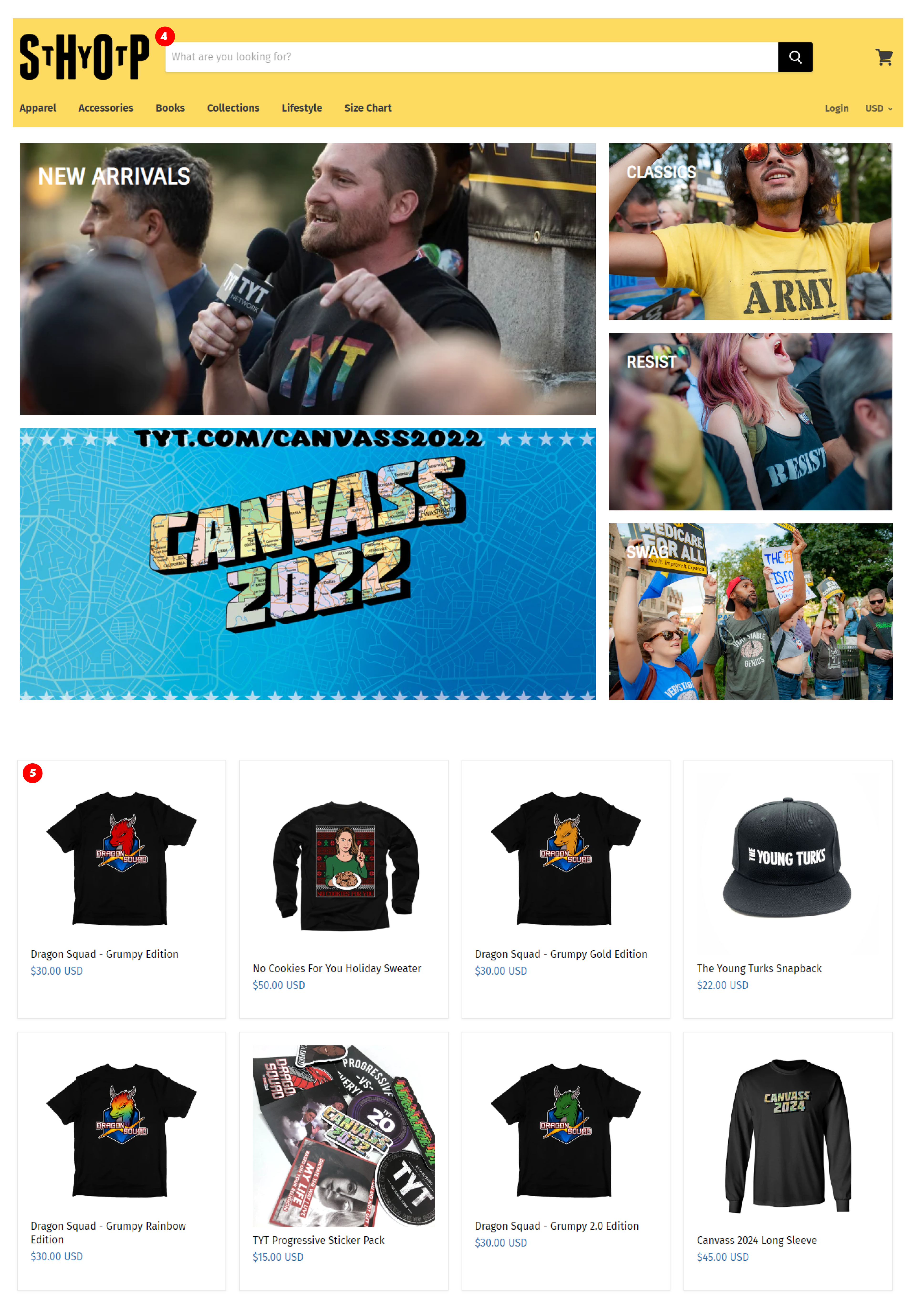
The Young Turks (TYT) have successfully established a strong brand identity with their title card and set design. The use of a simple and professional "newsdesk" design conveys a sense of trust and respect, which is important for a news organization. This visual branding communicates the channel's goal to delivering accurate and credible information to their viewers. The clean and modern aesthetic of the title card and set design also communicates a level of professionalism, further enhancing the channel's credibility in the eyes of their audience. By establishing a strong visual identity, TYT have positioned themselves as a trusted and respected source for progressive news and commentary, effectively communicating their core values and mission to their audience.
TYT's logo is a good example of simple yet effective branding. The simplicity of the design means that it is versatile and can be used across various mediums, such as on their website, social media, merchandise, and even in the title cards of their various shows. The logo is effective in representing the brand as a whole, but also has the ability to be applied to individual shows or personalities within the organization. This gives the brand a sense of cohesiveness, as each component of the brand is tied together with a common visual thread. As a result, TYT's branding is effective in communicating their professionalism, expertise, and trustworthiness to their audience.
TYT has a good approach to branding for their individual shows and personalities. The individual branding for each show is dynamic and eye-catching, making it easy for audiences to identify and engage with their favorite programs. This approach not only strengthens the individual brands of each show and personality, but it also adds to the cohesiveness of TYT's brand as a whole. By having a strong, consistent visual language, TYT is able to reinforce their reputation as a trustworthy and respected source of news and commentary, while also allowing for individual shows and personalities to shine and build their own fanbases.
They have decent merchandise (5), but the logo (4) for the shop could be improved. A strong shop logo can help attract potential customers and increase brand recognition, so it's important to have a logo that is visually appealing and memorable.
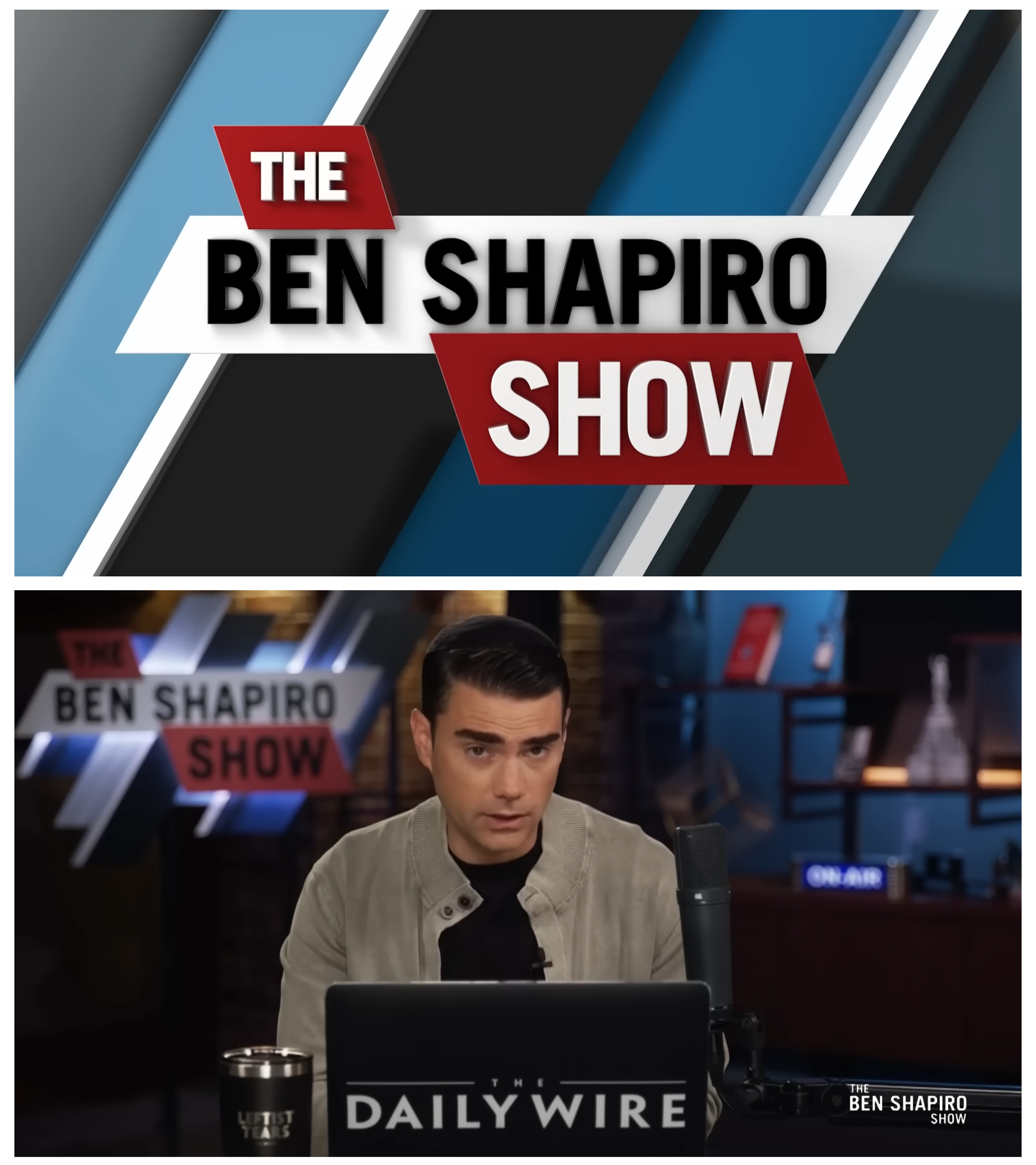
Overall, The Daily Wire's branding is confident, straightforward, and conservative, appealing to their target audience of right-leaning individuals. Each personality within the organization has their own high quality individual title card and set design. A common theme of the conservative "alternative media" is a more personal and intimate set, where it tries to make the audience feel like they're in the creators home. In contrast, the more "newsdesk" feel of The Young Turks, though it projects a sense of professionalism and trust, it lacks a more personal connection to the audience.
Overall The Daily Wire's website is well laid out, clean, and engaging (1). The logo is lacking somewhat, but considering each personality has their own branding, it would make sense to lean towards a more simple approach. They've branded the different categories of pages as well, with the more informal "discuss" videos (2) having the orange border on the top and bottom of the thumbnail.
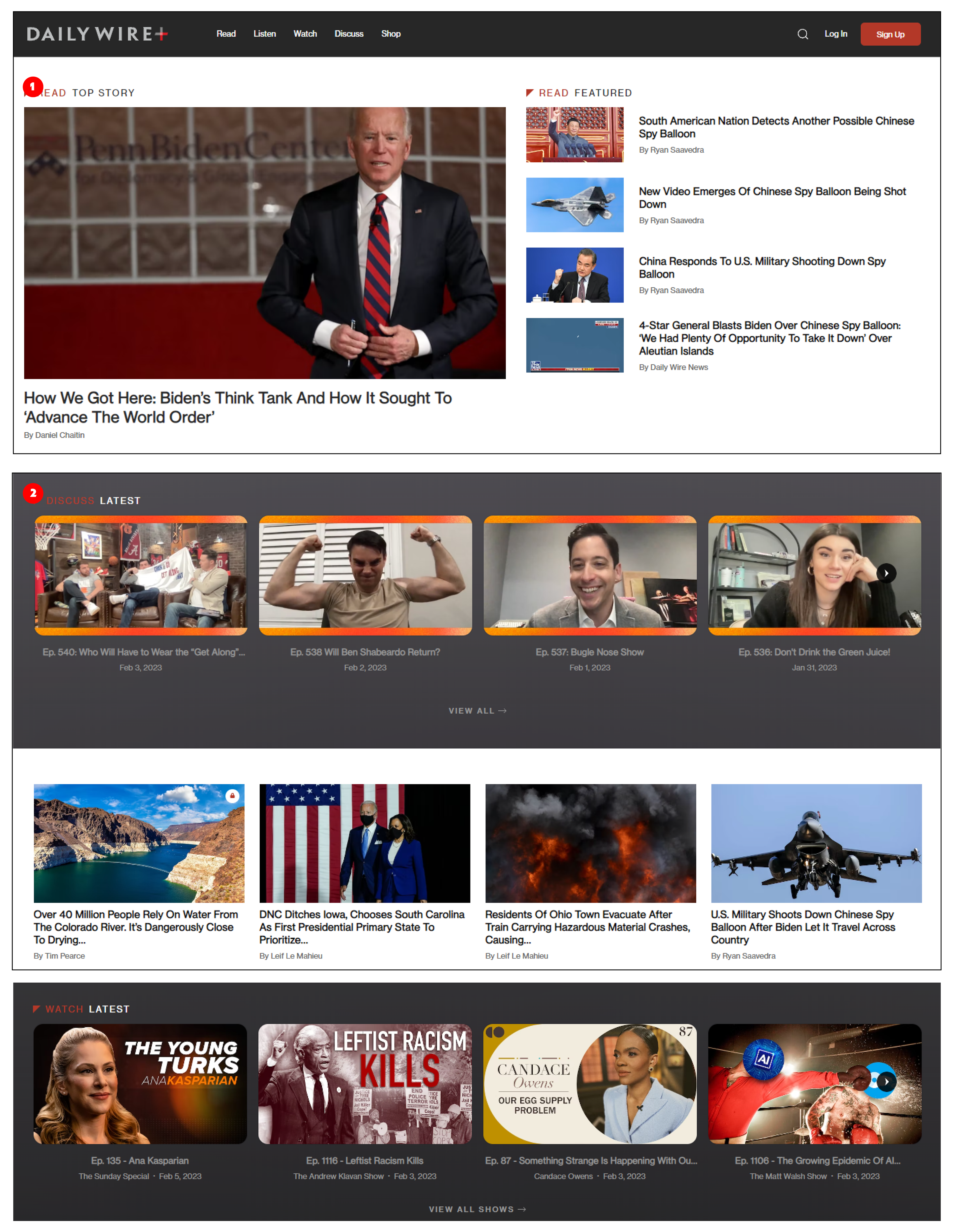
Their video section is well laid out and showcases the different higher budget and individual personality videos. You can tell they've spent a significant amount of money on the design of their branding, and I think it shows.
For the articles page, the images they've used have been branded to each personality, and each image is different in some way (4,5). They're able to use a few headshots and change the graphics up to create new thumbnails for each article, keeping them from looking monotonous and stale.
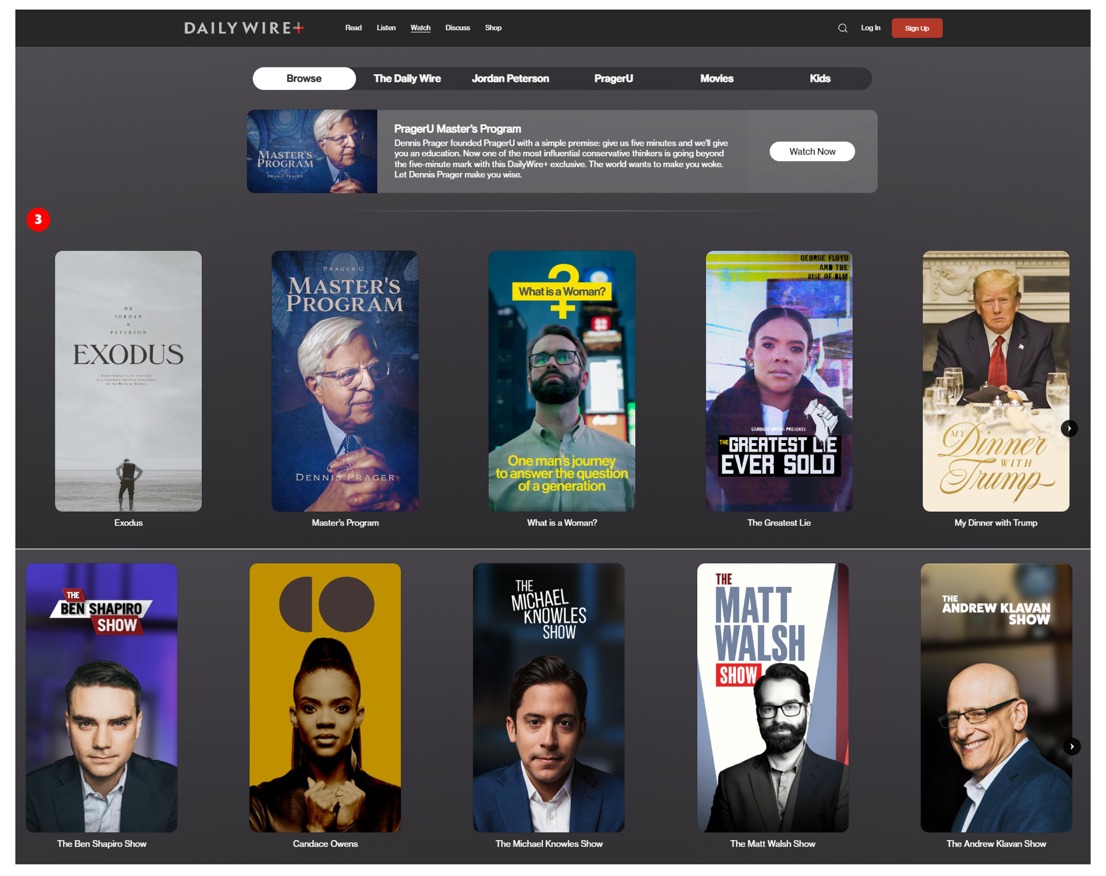
The Daily Wire merchandise is on point, and the shop logo (6) is neutral so the audience focuses on the individual brands that make up the merch store. The amount of items they sell is pretty surprising (7), and they're all designed very well. Each personality has their own branded merchandise specific to them (8, 9, 10).
"Jeremy's Razors" (10) line of products really stand out because they're designed so well. One could assume they hired someone who has a lot of packaging design experience, because they look like a line of products you might find in stores.
In Conclusion...
I think the brands that are showcased here offer a good range of the brands you could possibly be competing with, what you would want to implement in your own branding, and what you may want to avoid.
I'm especially surprised with the lack of branding Tim Pool has, considering his size in the industry. I think that with a better and professional design of his brand, he could significantly increase his audience and influence. I would give the same advice to David Pakman, though I think he's in a better position than Tim's brand, he could use a bit more personality and character.
Steven Crowder's branding is done well I think. The fact that he's trying to enter the ring of creating a network, he may end up updating his branding to reflect that. What Crowder has now as far as set design and branding really showcases his personality, and I'm sure it's been integral in growing his audience.
The two news networks with multiple creators or personalities, TYT and The Daily Wire, are brands that have spent a lot of time and money to create what they are today. Both of them showcase and brand their creators very well, while still keeping a cohesive look. Where I think The Daily Wire takes the lead is their set design and their merch. Creating a space that the audience feels like they're stepping into the creators individual space or home helps create a more intimate bond with that person. Having well designed and branded merchandise also helps build and keep that connection to the brand. You can tell they've spent a significant portion of their budget on design and branding, but in the long run it helps bring in more revenue and brand recognition.
Hopefully this helps in your decision making with your own brand into the future in some way. Whether you would want my help in that is up to you, but I hope you at least consider it. Nevertheless, I appreciate what you do in this space and as an online personality in general, and I can't wait to see what you do in the future.
dggL,
Austin Smith :)